Heuristic Evaluation
Severity Rating
Source: Jakob Nielsen 10 Usability Heuristics


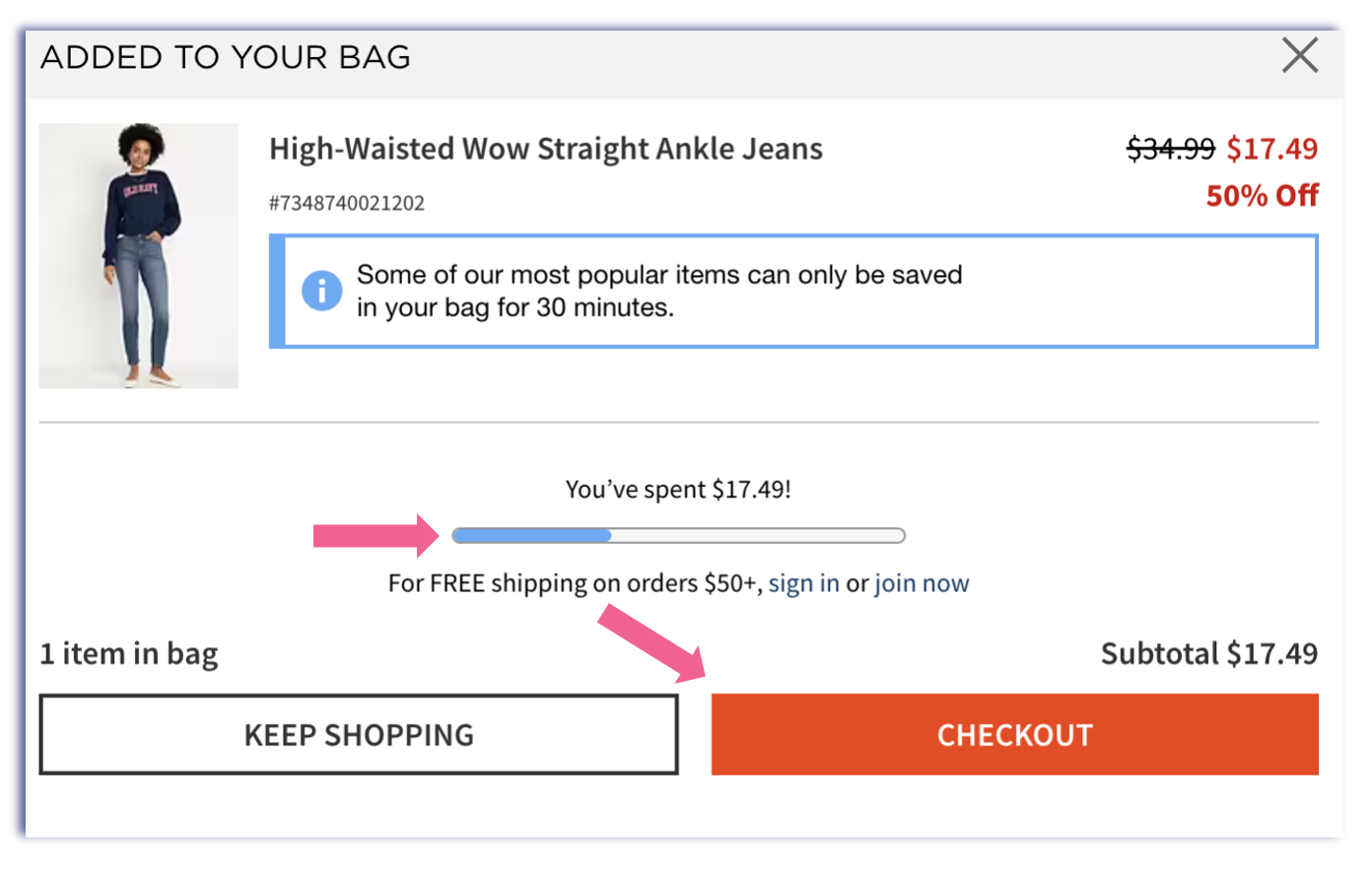
● Alert shoppers that the item is now in their bag
●Calls out how much the shopper has spent and how much more they need to spend for free shipping
●Buttons to continue shopping or checkout

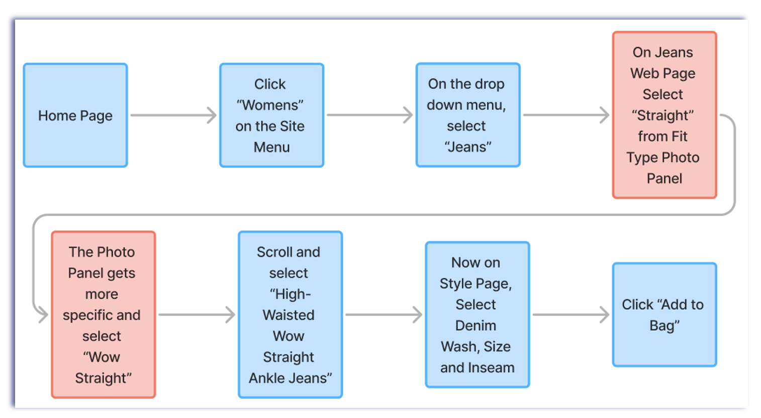
●Clothing categories are clear and easy to understand
●Department categories use common size ranges
●Product Details, Materials & Care and Fit & Sizing use familiar terms


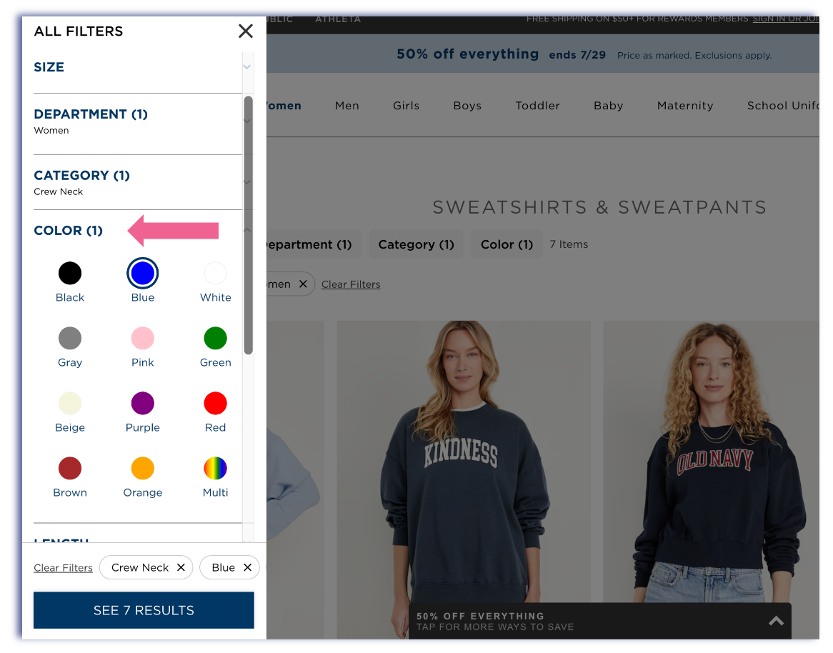
●Shoppers can search by categories
●They can also filter by color, fabric material, price, sleeve length, etc.…
●The filters are very specific so the shopper can find the right product


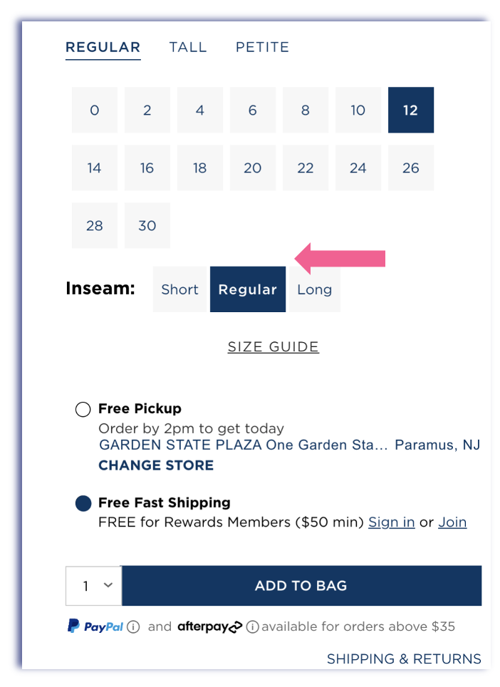
● The Old Navy website uses navy to highlight selected sizes and inseams.
●Add to Bag is also in bold navy so it is easy to find and see
●The website uses the consistent font in either bold or normal
●Any price reductions and percentage off are in bold red


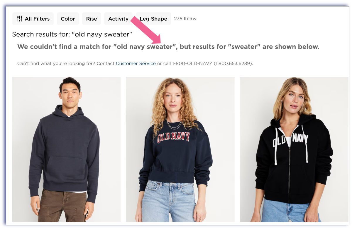
●Shoppers can enter keywords, and if there is not a match, the website shows the next best thing
●This could be helpful if the shopper is looking for a specific product using only keywords

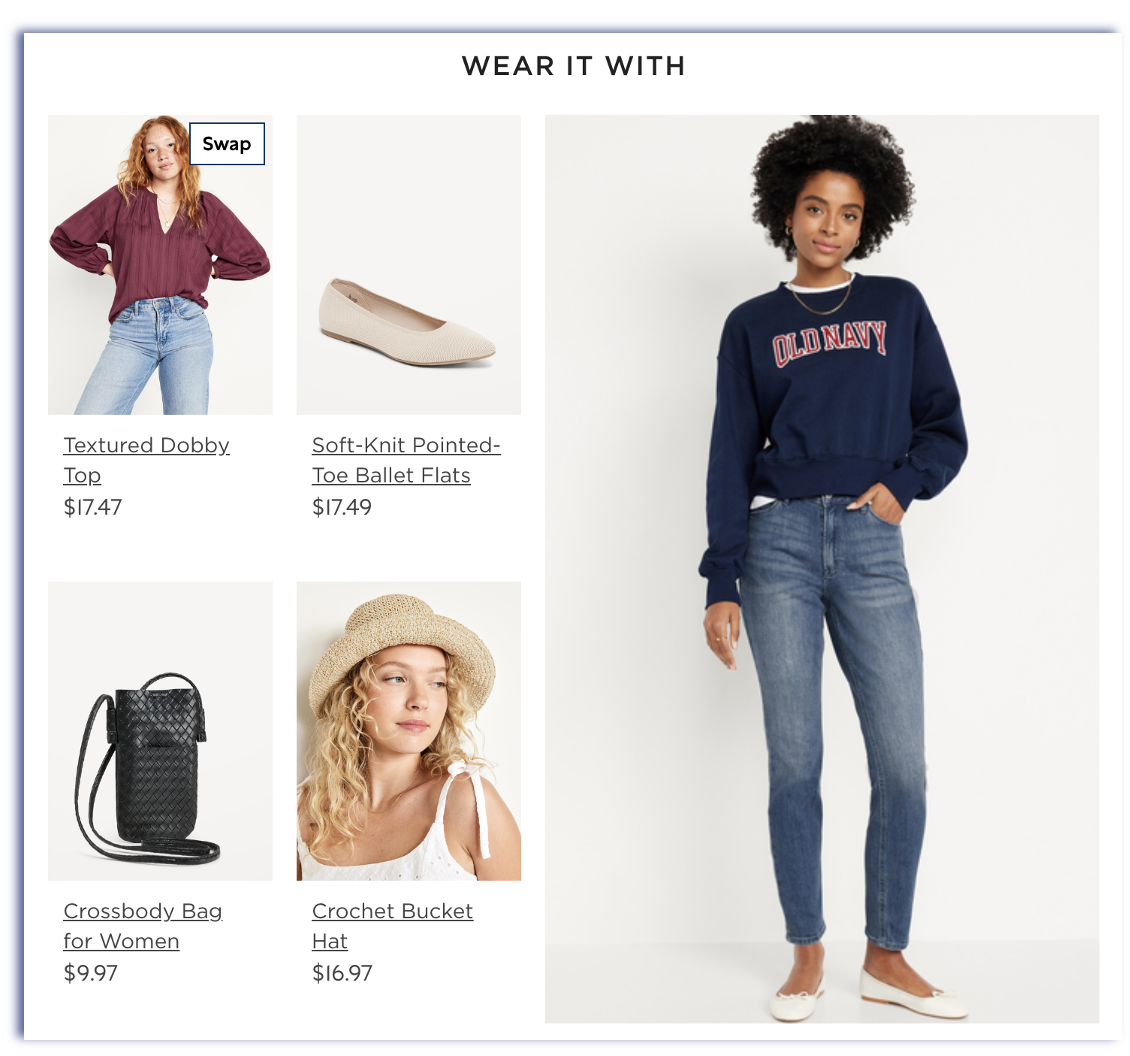
●In the suggestion area, you can not search for the exact look in the photo
●You have to search separately to match the style of the model
●Based on the “Wear It With,” I assumed I could mimic the exact outfit, so it is unclear to the shopper

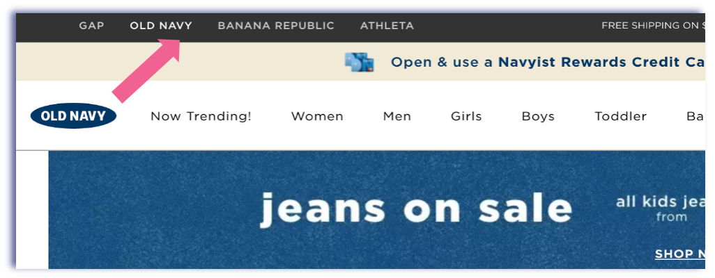
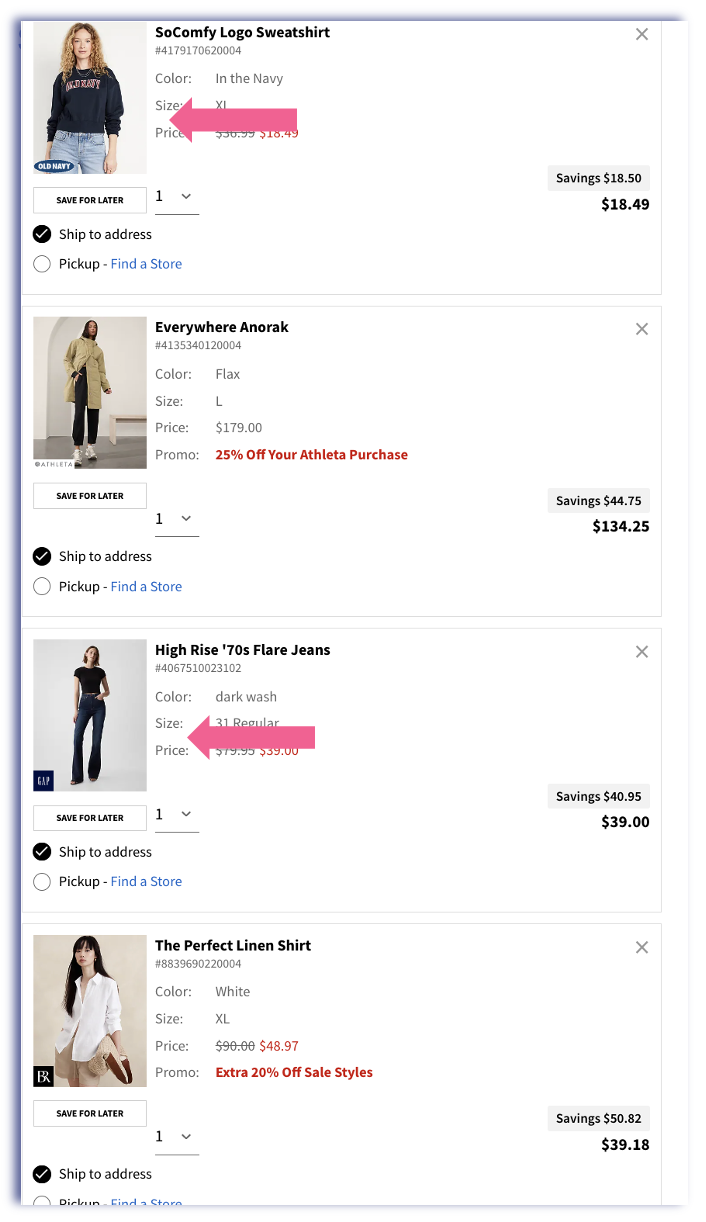
●Shoppers can toggle between all companies under the Gap/Old Navy Umbrella.
●Shoppers can also buy items from different stores and only check once

● The home page is very busy, and there is a lot of information to go through
●The colors on the home page are very vibrant and very saturated
●However, The photo grid on the style pages is clean and organized

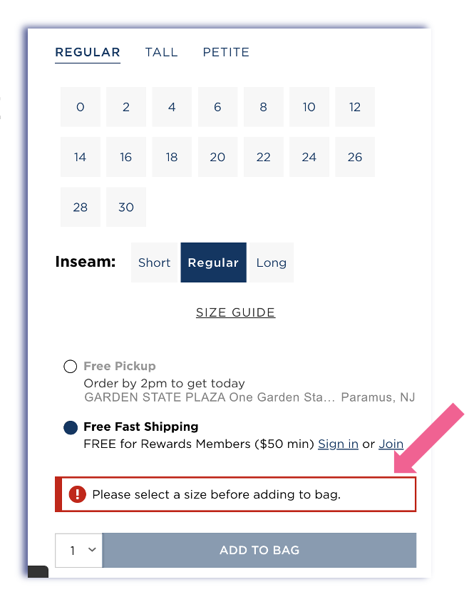
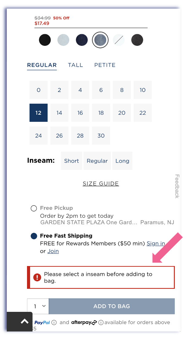
●Shoppers will get an error message if they do not select all the correct options
●The error message is in bold red and easy to understand
●The Add to Bag button stays faded out until the correct selections are made

●If Shoppers need help with any functions online, they can find the answers at the bottom of the website
●However, this may be too much information to go through
●Shoppers also have links to the social media pages where they can find additional information

Cognitive Walkthrough

Usability Issue: Memorability
●Issue: When you search for dresses, rompers, and skirts also appear, which could confuse the shopper looking for something very specific. and means they need to filter or search more to find the product they want
●Solution: Shoppers can go to the site menu under Womens and select Dresses from the drop-down. However, since the search feature is available, the website could use AI recognition to be able to better filter out unlike products


Usability Issue: Learnability
●Issue: You have many options when selecting the Fit Style Type. If the shopper is unfamiliar with Old Navy, they may not understand the difference between “OG Straight” and “Wow Straight.”
●Solution: A Feature that allows shoppers to select similar products and compare side-by-side to understand the difference better. “OG” is slang, so maybe callout means “original.”

Usability Issue: Efficiency
●Issue: On the Old Navy Website, Promos and discounts are in bold red font; however, on other websites, the discounts are sometimes light grey or just normal in red font. It is not consistent. It is not easy to spot for shoppers before they checkout.
●Solution: Keep promos and discounts in bold red for all websites since shoppers are browsing all the websites, which will help them avoid confusion.